16 Bedroom Colour Palette Ideas That Make Any Room Feel Instantly Cohesive
By the Viral Info team · Updated November 2026 · 3 min read
A good colour palette is what makes a bedroom feel pulled together. When walls, bedding, rugs and art share a few related shades, the room feels calm and intentional. These 16 bedroom colour palette ideas give you ready-made schemes and simple rules for using them.
How to build a palette
| Item |
Why it works |
| Main colour (60%) |
Walls and large surfaces |
| Secondary colour (30%) |
Bedding, curtains and rug |
| Accent (10%) |
Cushions, art and decor |
| Neutral |
Whites and woods to rest the eye |
| Metal |
One finish such as brass or black |
Calm palettes
- Dusty blue, cream and terracotta for a balanced, warm-cool mix.
- Pale sage, oat and white for a fresh, restful room.
- Soft grey, blush and white for gentle warmth.
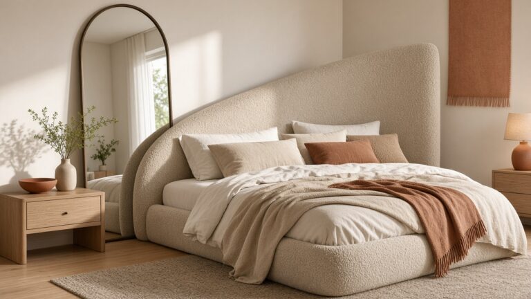
- Warm white, linen and light oak for a classic neutral.
Warm palettes
- Camel, cream and rust for a cosy autumn feel.
- Terracotta, sand and olive for earthy warmth.
- Mushroom, ivory and brass for quiet luxury.
- Butter yellow, white and soft green for a sunny room.
Moody palettes
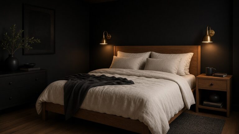
- Deep green, cognac and brass for a rich retreat.
- Navy, cream and walnut for a classic look.
- Charcoal, plaster pink and black for drama.
- Plum, mauve and gold for romance.
Using your palette
- Pull colours from a favourite artwork or rug.
- Repeat each colour at least three times in the room.
- Test paint samples on several walls at different times of day.
- Keep woods consistent in tone across furniture.
Tip: Paint looks different in north- and south-facing rooms. North light makes colours look cooler and darker, so choose warmer shades there, and test large painted swatches before committing.
FAQ
What colours make a bedroom feel calm?
Soft blues, sages, warm whites, greige and muted earth tones are calming and restful.
How many colours should a bedroom palette have?
Usually three main colours plus neutrals and one metal finish.
What is the 60-30-10 rule?
Use your main colour on about 60 percent of the room, a secondary colour on 30 percent and an accent on 10 percent.
Keep reading